For working in transparent AR, especially with head-mounted devices like HoloLens, an intuitive UI is essential. This UI must differentiate itself from the 3D GUIs designed for VR. At present, many resort to a combination of Unity and MRTK. Yet, using a large monolithic closed 3D engine and extensions that aren’t very standard from a UX perspective has its issues, especially in a professional environment.
FOV and GUI
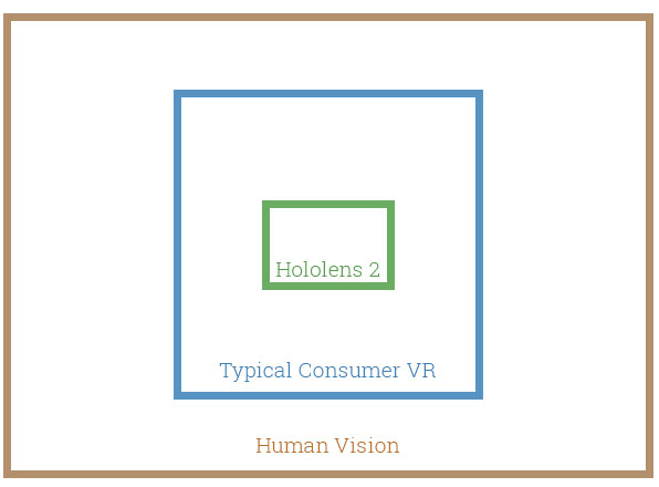
The HoloLens 2, one of the most widely used AR devices today, has a horizontal FOV of 43 degrees and a vertical FOV of 29 degrees. Even if there are advancements in the field of vision, as seen with IVAS (which is based on HoloLens 2 and uses two displays per eye to increase FOV), we cannot anticipate a field of view much beyond 60 degrees. This limitation restricts the space available for UI, ensuring a clear perspective for tasks. A further challenge is the necessity to project controls predominantly at eye level, leading users to raise and maintain their hands in an empty space – this can be tiring during prolonged use.

VAC and Ergonomics
Another hurdle is VAC. HoloLens displays are set at an optical distance roughly 2.0 m away from the user. Content closer than 1 m can be challenging to engage with, and it’s strongly advised not to place holograms nearer than 40 cm. If the UI adopts a touch-based virtual approach, where users “reach” virtual control elements with tracked hands, it may not align with these optimal distances. If the UI is tailored to be touch-centric, allowing users to “reach” virtual control elements with tracked hands, it might not match the recommended optimal distances, straining the eyes and mind and making such solutions inadvisable for sustained work.
Additionally, the general public struggles with 3D GUIs as most users are unfamiliar with this technology. It may pose challenges to them to connect with virtual objects without tangible touch feedback. Notably, in our experience, many first-time users struggle with even the most straightforward AR interfaces. Potentially, this can also be dangerous as they might accidentally touch a machine or device obscured by the GUI in the glasses.
Solution with a Secondary Display
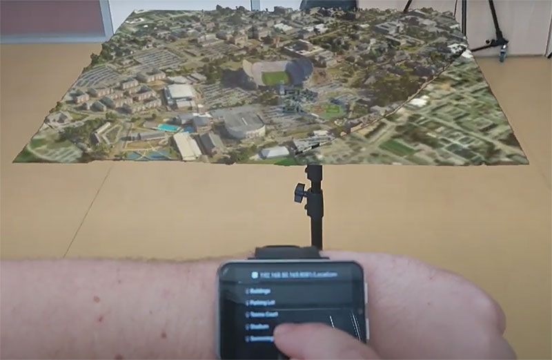
One possible solution is to use a secondary touchscreen, such as a tablet, phone, or even larger smartwatches. This allows for intuitive control, which most users are familiar with, and does not obstruct the view or suffer from incorrect focal distance. If future glasses become lighter, offloading some computations to such devices and only transmitting the final visuals and audio to the glasses becomes practical. When a user flips out the HoloLens 2 display, ensuring their view isn’t obstructed by it, some functions like audio or the front camera’s view might still be accessed and manipulated via this secondary interface.

Disadvantages
The drawbacks of this solution are, of course, related to the fact that it’s an additional connected device. Physical interaction is needed – making it unsuitable where, for example, sterility is essential. In some situations, the image from the glasses might overlay this touchscreen – however, this can be solved by tracking the screen and using a virtual mask with a black model for additive transparent AR.
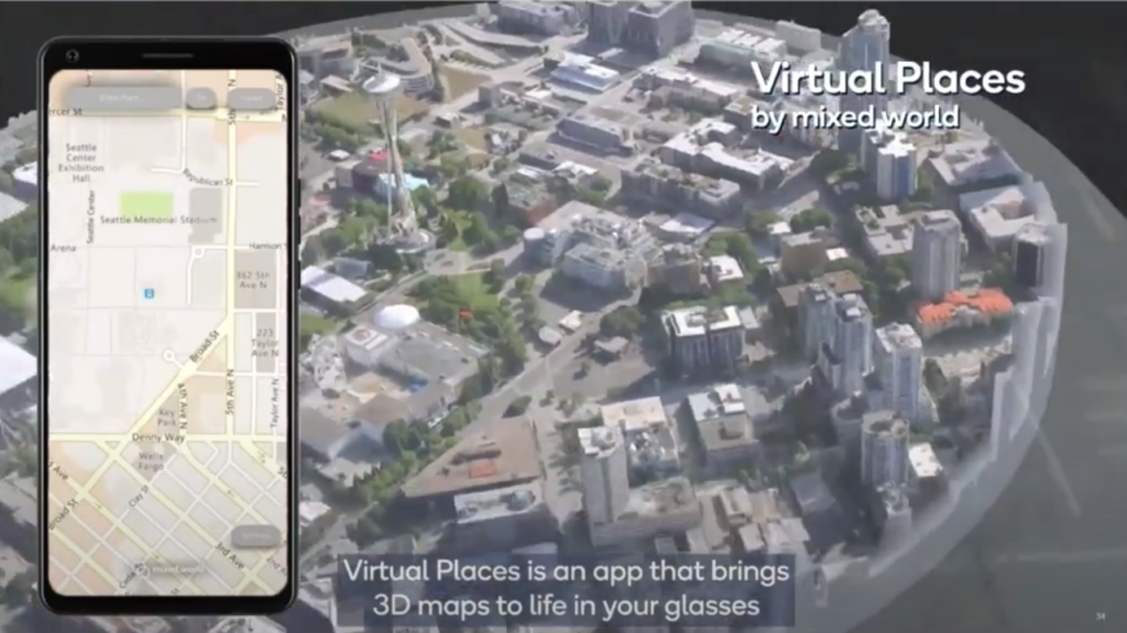
At QuaternAR, we are currently trying to develop a hybrid solution that would allow both classic 3D GUI and this external touch interface. Ideally, they should be combined freely. Apparently, we’re not alone with this idea, as Qualcomm is also aiming for a similar solution with something they call dual render fusion. What sets us apart is our approach: instead of a dedicated mobile app, we’re aiming to offer these additional controls through a browser-based application. This requires no installations, and developers can customize the webpage fully, thus broadening the use of this technology.

